VISUAL DESIGN | USER INTERFACE
Part of a comprehensive redesign for CarePayment, a healthcare finance company that helps patients in medical debt meet their financial obligations while protecting the financial health of provider organizations.
I designed this responsive website utilizing brand elements we created in-house at Push Design. After the initial concepts were approved, I worked directly with the client, content strategists at Aukema & Associates, and the in-house development team at Push to fine-tune various components of the site.
Role: Designer - Concept & Execution, Client Contact
Agency: Push Design,
Creative Director: John Close
Developers: John Miller, Vanessa Gill, Monica Shin
ANIMATION | ART PRODUCTION | SCREENWRITING
Based on the legend of the famous unsolved code, this short film was a collaborative effort that's creation took more than a year, from original concept to finished product.
My contributions ranged from working with the director to develop the story, writing the script, building out visual environments such as the train station and flashback dig site, as well as a number individual visual assets and animations, including the intro credits.
Role: Script/Story, Visuals, Rotoscoping, Intro Credits
Agency: Polymix Studios
Director: Andrew S. Allen
VISUAL DESIGN | USER INTERFACE
Website redesign for Seattle-based transportation and logistics services company, Foss Maritime. This was a unique project for me in that the task was to take a website I had previously designed and adapt it into a responsive site. This meant a careful balance of preserving the original structure while ensuring the site coherently translated to mobile devices.
The most significant design change involved replacing large background photos that constituted the canvas of interior pages with wide page header photography. This allowed us to showcase even more of the company's striking photography, giving each page a unique photo, while simulteneously improving individual page load times. In the end we succeeded in preserving all previously existing functionality for both desktop and mobile sites while sharpening the site's aesthetics and honoring the client's objectives.
Role: Designer
Agency: Push Design
Creative Director: John Close
Developers: John Miller, Vanessa Gill, Monica Shin
PUBLICATION DESIGN
I had the honor of designing the first issue of ARCADE's 30th year in publication. This meant creating the first issue in its new, smaller format, helping establish the jumping-off point for future design iterations.
As lead designer I was given the freedom and responsibility of creating the overall look for the issue, including the cover, as well as working directly with the ARCADE's staff throughout the process. In addition, my responsibilities included managing junior designer Noah Read, whom contributed layouts for several spreads of the issue.
Role: Lead Designer - Concept & Execution, Client Contact
Agency: Push Design
Creative Director: John Close
IDENTITY DESIGN | BRANDING
This project was a rebranding of a T-Mobile internal employee awards event held annually in Hawaii. Beginning with the logo redesign, we wanted the materials to better reflect the Hawaiian location and remind employees of the perks of winning the award. Color-coding of materials was achieved through the use of vibrant photography of the region's many colorful natural features. The communications package included name badges, luggage tags, water bottles, and other assorted promotional materials. Illustrations in white created by John Close.
Role: Designer
Agency: Push Design
Creative Director: John Close
VISUAL DESIGN | BRANDING
A system of custom printed components I designed for Swenson Say Fagét, a Seattle/Tacoma based structural engineering company. SSF came to us at Push Design to rethink their client proposal materials and devise a creative solution that would give them the flexibility they needed when creating packages of proposal materials that could range anywhere from a few project sheets, to over 100 pages of documentation. The key to the solution was focusing on SSF’s commitment to sustainability and their penchant for reusing existing structures and materials in their own projects. The design solution needed to reflect this philosophy in its form and design.
Role: Designer
Agency: Push Design
Creative Director: John Close
VISUAL DESIGN | USER INTERFACE
Desktop website design for the neo-folk band, Campfire Vaudeville. I was responsible for the design of the website from wireframes and visual concepts, to final production. I worked directly with the client and our developer one-on-one throughout the entire process to develop the aesthetic and functionality of the site.
Building on the styles I created for their music video and logo design, the goal was to create an environment that reflects the mood, time, and place the band was seeking to evoke. Influences ranged from folk music and "Oh Brother Where Art Thou?" to turn-of-the-century technologies.
Role: Design Lead, Client Contact
Agency: Push Design
Creative Director: John Close
Developer: John Miller
IDENTITY DESIGN
A collection of assorted logos I have designed.
VISUAL DESIGN | DIRECTION
Six video series explaining the virtues of the Microsoft Exchange archiving platform. The project was a collaboration between Push Design and BuzzBee of Seattle, and Microsoft. My responsibilities included all storyboards and visual asset creation as well as directing the voice over and animation. Animator Mike Amelang did a fantastic job bringing all the designs to life and creating the final edited product.
Role: Design Lead, Client Contact
Agency: Push Design
Creative Directors: John Close
VISUAL DESIGN | USER INTERFACE
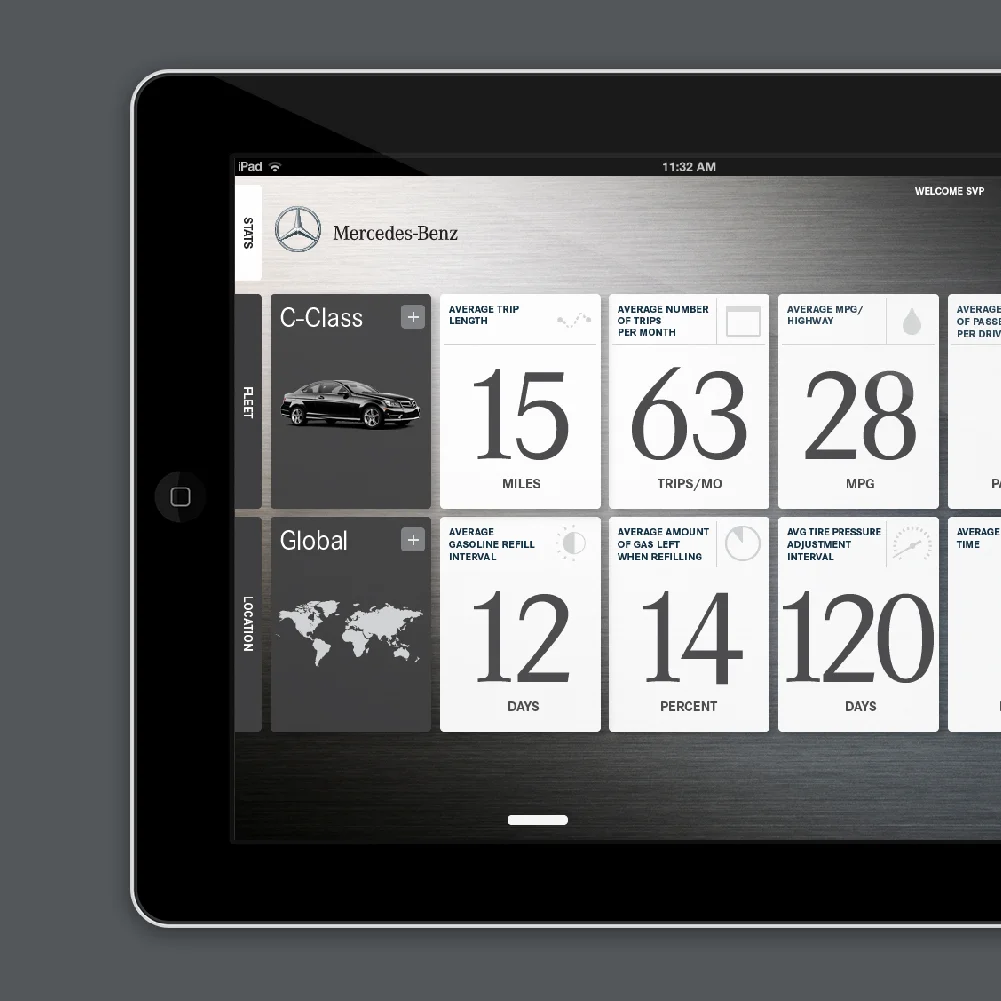
These designs were for an in-house metrics analysis tool proposed to Mercedes-Benz by development house Heated Details. Having worked previously with HD on the Noble House Hotels & Resorts suite of property websites, Heated Details came to Push Design to create visual concepts for the tool that they would then build and execute.
Conceived of as an iPad application, the purposed tool was designed to give Mercedes-Benz an easy-to-use interface for comparing real-time vehicle metrics on their different vehicle classes, sorted and comparable by their regions of operation. My designs included an initial direction for the application, and a series of icons for various metrics.
While Mercedes-Benz eventually passed on the proposed concept, the experience of working on a blue-sky application of this nature with a global brand like Mercedes-Benz was its own reward.
Role: Designer
Agency: Push Design
Creative Director: John Close
PUBLICATION DESIGN
ARCADE is a northwest quarterly architecture and design publication that promotes and explores quality design in the built environment. A not-for-profit educational organization, ARCADE reinvents its aesthetics every year by having local graphic designers recast the look of the magazine, four issues at a time. Push Design was given the honor of contributing to this design tradition in the 25th anniversary issues. I jumped into the project during the 2nd issue and had an increasing role through issues 25.3 and 25.4 including most interior spreads, the feature in 25.4, and cover designs for both issues.
Inspired by ARCADE's commitment to stretching it's visual boundaries, John Close's novel structure literally turned the magazine on its head, shifting the orientation of the non-feature interior pages into large vertical spreads. This allowed us to create compositions on a much larger, more architectural scale, and opened up new design solutions which reflected the larger themes of the publication itself.
Role: Designer
Agency: Push Design
Creative Director: John Close
VISUAL DESIGN | USER INTERFACE
Website designs for a Seattle/Tacoma-based structural engineering company. SSF wanted their website to showcase their extensive body of work while conveying their irreverent and often humorous personalities.
The page structure reflects a large workspace used to flesh out new ideas and collaborate, with content animating onto the page like unrolling blueprints. The stop-motion animated intro to the site of a fluid origami form illustrates their philosophy of flexibility, creativity, and problem solving. The imagery consists of a mix of SSF projects and original photography I took around their offices.
Role: Designer - Original Concepts & Execution
Agency: Push Design
Creative Director: John Close
Developer: James Nicolaysen
VISUAL DESIGN | MOTION DESIGN
Music video intro animations for the neo-folk band, Campfire Vaudeville. Based on the idea of a memory from the past brought to life through music, the concept was tied directly to ethos of the band and their aesthetic.
Role: Design Lead - Concepts & Execution, Client Contact
Agency: Push Design
Creative Directors: John Close, Charles Oliver
VISUAL DESIGN
The FYI poster show is an annual event put on by AIGA that celebrates the art of information design and its influence on culture. Looking for a unique spin on the topic, I thought it would be fun to do an unexpected version of the popular neighborhood poster motif, using a fictional geography.
I was able to construct this with the assistance of a map created by Eliot R. Brown's for DC Comics. Aside from an easy excuse to try my hand at the style, I had hoped to spark the idea that information design is a tool for understanding that can be applied to notions outside the realm of pure facts and data.